
A neutral color palette isn’t about playing it safe, it’s about creating a foundation that won’t fight your furniture, compete with your art, or feel dated in three years. Think of neutrals as the drywall and framing of good design: they’re the structure that lets everything else work. Whether you’re repainting a single room or tackling a whole-house refresh, understanding how to choose, layer, and accent neutrals will save you from costly repaints and buyer’s remorse. This guide walks through the practical side of neutral interior design, from selecting the right shades to adding texture and personality without losing that clean, cohesive look.
Table of Contents
ToggleKey Takeaways
- A neutral color palette creates a versatile foundation for interior design that pairs with any accent color, hides imperfections better than bold colors, and increases resale value by helping buyers envision their own furniture in the space.
- Lighting dictates neutral color choices—warm-toned neutrals like creamy whites and beiges work best in cool north-facing rooms, while cooler grays and greiges balance the warmth in south-facing spaces with abundant natural light.
- Always test paint samples on multiple walls over 24 hours in different lighting conditions before committing to full gallons, since undertones shift dramatically between morning light, afternoon sun, and evening artificial light.
- Layer at least three different textures and materials—such as linen, wool, wood, stone, and rattan—to prevent neutral interiors from feeling flat and monotonous, adding depth and visual interest without introducing bold color.
- Anchor neutral color palettes with one or two muted accent colors used sparingly in pillows, artwork, or lighting, combined with warm LED bulbs (2700K–3000K) and plants to create warmth and personality without compromising the calm, cohesive look.
- Stick to three to four core neutral shades per room to maintain visual cohesion, and use different paint sheens strategically—flat finishes for low-traffic areas, eggshell or satin for kitchens and hallways, and semi-gloss for trim and doors.
What Is a Neutral Color Palette and Why Does It Work?
A neutral color palette uses colors with low saturation, whites, grays, beiges, taupes, and earth tones, that don’t lean heavily toward any single hue. These colors reflect light evenly and don’t create strong contrasts, which makes spaces feel larger and more cohesive.
Neutrals work because they’re versatile. They pair with nearly any accent color, so you can swap throw pillows, rugs, or artwork without repainting. They also hide imperfections better than bold colors: a scuff on a greige wall blends in, while a scuff on navy blue screams for touch-up.
From a practical standpoint, neutrals increase resale value. Buyers envision their own furniture in a neutral space more easily than in a room painted chartreuse. If you’re flipping a property or planning to sell within five years, neutrals are the safest ROI.
Neutrals aren’t boring, they’re a backdrop. The key is layering undertones (warm vs. cool), textures, and strategic pops of color to avoid a flat, hotel-lobby feel.
Core Neutral Colors to Build Your Palette Around
Start with whites and off-whites. Pure white (like a flat ceiling white) can feel sterile, so most designers lean toward off-whites with warm undertones, think creamy ivory or soft linen. These shades keep rooms bright without the harshness.
Grays are popular but tricky. Many grays have blue or purple undertones that clash with warm lighting or wood tones. Test samples in your space at different times of day. A gray that looks perfect at noon might read lavender at dusk. Greige, a blend of gray and beige, is more forgiving because it balances warm and cool.
Beiges and taupes bring warmth. Classic beige can skew yellow or pink depending on undertones, so pair it with cooler accents if it’s leaning too warm. Taupe sits between gray and brown, making it a solid middle-ground choice for walls, trim, or cabinetry.
Earth tones, soft browns, warm grays, muted olives, add depth without color intensity. These work well in spaces with lots of natural materials like wood flooring or stone countertops.
Stick to three to four core neutrals per room: one for walls, one for trim or ceiling, one for large furniture, and one for flooring or large rugs. This keeps the palette cohesive without feeling monotonous.
How to Choose the Right Neutral Shades for Your Space
Lighting dictates everything. North-facing rooms get cooler, bluer light, so warm neutrals (beiges, creamy whites) balance the chill. South-facing rooms flood with warm light, so cooler grays and greiges prevent the space from feeling too yellow.
Test paint samples on multiple walls, not just one. Paint a 2-foot by 2-foot square on each wall and observe it over 24 hours. Morning light, afternoon sun, and evening artificial light all shift undertones. What looks like a soft gray at 10 a.m. might turn purple under LED bulbs at 8 p.m.
Consider existing materials. If you have honey oak floors or warm wood cabinets, cool grays will clash. Warmer neutrals, beiges, taupes, soft whites, harmonize better. If you’ve got cool-toned tile or stainless appliances, cooler grays and whites feel more cohesive.
Sheen matters. Flat and matte finishes hide wall imperfections but are harder to clean, fine for low-traffic bedrooms, not ideal for hallways or kitchens. Eggshell or satin finishes offer a slight sheen, reflect more light, and wipe down easier. Use semi-gloss on trim and doors for durability and a subtle contrast against flat walls.
Buy quart-sized samples before committing to gallons. Most paint stores sell sample jars for $5–$10. Slap them on the wall, live with them a few days, then decide. It’s cheaper than repainting an entire room because the color looked different on the chip.
Layering Textures and Materials for Depth
Neutrals live or die by texture. A room painted all one shade of beige with smooth walls and no variation feels like a cardboard box. Add texture, and suddenly it’s interesting.
Wall treatments add dimension without color. Shiplap, board-and-batten, or wainscoting create shadow lines that break up flat surfaces. If you’re DIY-ing these, MDF or primed pine work well for painted finishes. Use a miter saw for clean joints and a nail gun with 18-gauge brad nails for installation. Fill nail holes with lightweight spackle, sand smooth, then prime and paint.
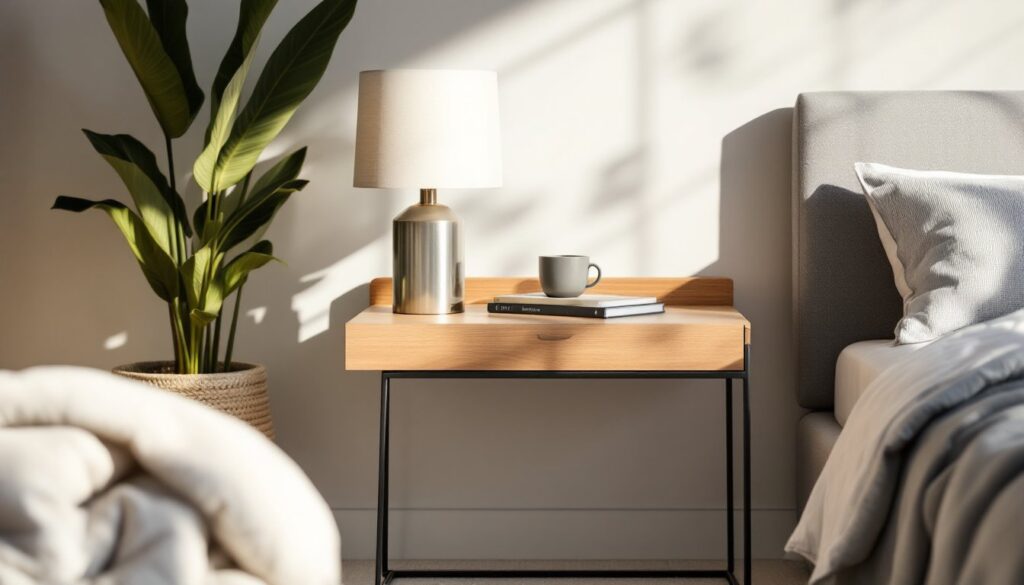
Textiles introduce tactile variety. A linen sofa, wool throw blanket, velvet pillows, and a jute rug all read as neutral but each has a distinct texture. Layer at least three different fabric types in a room for depth. Mixing smooth, nubby, and soft textures keeps the eye moving.
Natural materials, wood, stone, rattan, leather, bring organic warmth. A reclaimed wood coffee table, stone fireplace surround, or woven pendant light adds character without introducing bold color. If you’re installing a stone backsplash or countertop, remember that natural stone needs sealing (granite, marble, soapstone all have different maintenance needs).
Designers often suggest enhancing neutral interiors with pattern through rugs, wallpaper, or upholstery to add subtle contrast without overwhelming the palette.
Contrast in finish also creates interest. Pair matte walls with glossy trim, or a flat ceiling with semi-gloss doors. This works especially well in small spaces where you don’t have room for a lot of decorative accessories.
Adding Warmth and Personality to Neutral Rooms
A neutral palette doesn’t mean sterile. Small doses of color and personal touches keep a space from feeling like a hotel lobby.
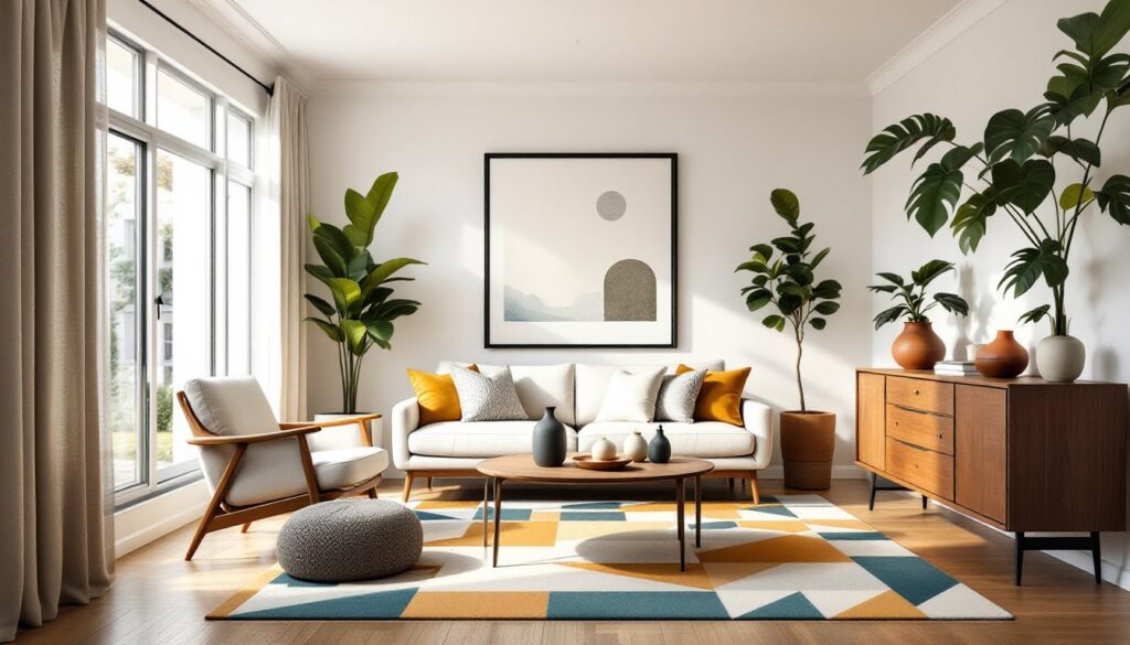
Accent colors anchor neutrals. Choose one or two colors, muted blues, soft greens, warm terracottas, and use them sparingly in pillows, throws, artwork, or a single accent wall. Stick to colors with similar saturation levels so they don’t compete.
Artwork and decor inject personality. Black-and-white photography, abstract prints, or even a single bold painting give the eye a focal point. Frame art in black, natural wood, or brass to tie into your neutral palette. If you’re hanging a gallery wall, use a paper template taped to the wall to plan spacing before hammering nails.
Lighting layering warms up neutrals. Overhead ambient lighting (recessed cans, flush mounts) provides general illumination, but it’s flat. Add table lamps, floor lamps, and sconces for task and accent lighting. Warm LED bulbs (2700K–3000K) make neutrals feel cozy: cool LEDs (4000K+) can make grays and whites feel clinical.
Plants soften hard edges and add life. Even low-maintenance options, snake plants, pothos, ZZ plants, bring organic shape and a subtle pop of green. Use ceramic, terracotta, or woven planters that complement your neutral scheme.
Many home design platforms showcase real-world examples of layering decor and greenery in neutral spaces to create warmth without overwhelming the palette.
Personal collections, books, ceramics, vintage finds, make a space yours. Display them on open shelving or a console table. Just keep it edited: clutter kills the calm vibe neutrals create.
Room-by-Room Neutral Design Ideas
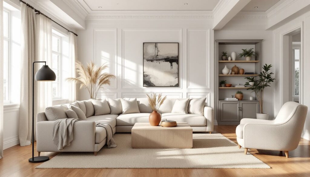
Living rooms benefit from layered neutrals. Paint walls a soft greige, keep the ceiling white, and use a beige or gray sectional. Add a natural fiber rug (jute or sisal), wood coffee table, and linen drapes. Accent with black metal lamps or picture frames for contrast.
Kitchens in neutral palettes often use white or off-white cabinetry with gray or beige walls. Quartz or marble countertops in whites and grays fit the scheme. If you’re painting cabinets, use a bonding primer (like Zinsser B-I-N or Benjamin Moore Advance Primer) for adhesion, then a durable acrylic-alkyd paint (Benjamin Moore Advance, Sherwin-Williams ProClassic). Two coats minimum, light sanding between coats with 220-grit sandpaper.
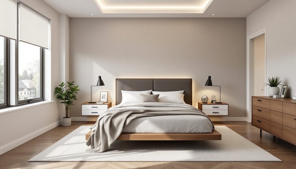
Bedrooms thrive on soft, warm neutrals, cream, taupe, soft gray. Layer bedding in linen, cotton, and wool for texture. Use blackout curtains in a neutral tone if you need light control. A wood headboard or upholstered headboard in a neutral fabric keeps the look cohesive.
Bathrooms can handle cooler neutrals, whites, light grays, soft blues. Subway tile in white or gray is classic and easy to clean. If you’re retiling, use a wet saw for straight cuts and a tile nipper for notches around fixtures. Thin-set mortar should be mixed to a peanut butter consistency: too wet and tiles slip, too dry and they won’t adhere. Grout lines should be 1/8 inch for wall tile unless you’re using rectified tile. Seal grout after it cures (usually 72 hours) to prevent staining.
For inspiration, many interior design galleries feature room-specific neutral palettes with before-and-after photos and material lists.
Home offices work well with mid-tone neutrals, greige walls, white trim, a wood desk. Keep it calm but not so soft you feel sleepy. Add task lighting and a pop of color in a desk chair or artwork.
Conclusion
A neutral color palette is a smart, flexible foundation for any home. It’s not about avoiding color, it’s about creating a calm, cohesive backdrop that lets you swap accents, adjust decor, and change your mind without a full repaint. Test your shades, layer textures, and don’t skip the small details. Done right, neutrals feel intentional, not boring, and they’ll look good for years.