
Walk into most homes and you’ll spot the same design missteps repeated room after room. Oversized sectionals crammed into small living rooms. Every piece of furniture hugging the perimeter like it’s afraid of the center. A single overhead light doing all the heavy lifting. These aren’t just aesthetic problems, they make spaces feel cramped, dysfunctional, and uncomfortable. The good news? Most bad <a href="https://mintterrace.com/garage-interior-design/”>interior design stems from a handful of fixable mistakes. Understanding scale, furniture placement, lighting strategy, and material selection will transform a room faster than any trend-chasing Pinterest board. Here’s what’s actually going wrong in your space and how to correct it with practical, DIY-friendly adjustments.
Table of Contents
ToggleKey Takeaways
- Bad interior design stems from fixable mistakes in scale, furniture placement, lighting, and material selection—not from lacking style or budget.
- Properly scaled furniture with adequate walkways (30 inches minimum) and correct proportions (sofa-to-table distance of 14–18 inches) prevent cramped, dysfunctional spaces.
- Floating furniture 12–24 inches from walls creates intentional conversational zones and eliminates dead spaces that wall-to-wall placement produces.
- Layered lighting combining ambient, task, and accent sources transforms a room’s functionality and mood far more effectively than a single overhead fixture.
- Paint should be one of your final design decisions—test colors on multiple walls and times of day against fixed elements like flooring and cabinetry to avoid clashing undertones.
- Choose permanent materials (tile, countertops, built-ins) in neutral tones and express personality through changeable elements like textiles, hardware, and accent pillows that align with your actual lifestyle.
Ignoring Scale and Proportion in Your Space
Proportion matters more than style. A 72-inch sectional in a 10×12 room leaves no breathing room for traffic flow, while a lone loveseat in a 20×20 great room looks like an afterthought.
Measure your room dimensions before shopping for furniture. As a baseline, leave at least 30 inches of walkway space around major pieces. For seating areas, the distance between a sofa and coffee table should be 14–18 inches, close enough to reach a drink without standing, far enough to avoid stubbed toes.
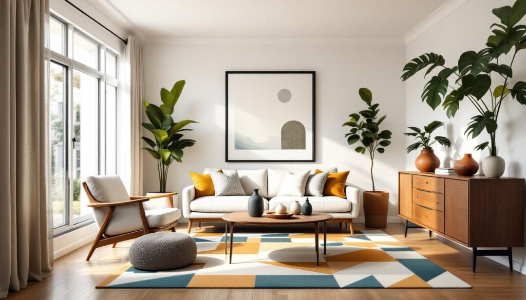
Oversized art on small walls or tiny prints floating on expansive surfaces both signal a mismatch. A framed piece should occupy roughly two-thirds to three-quarters of the furniture width beneath it. For gallery walls, treat the entire grouping as one large piece and apply the same rule.
Rug size is another common proportion error. In living rooms, all furniture legs should rest on the rug, or at minimum, front legs only. An 8×10 rug works for most standard living rooms: 5×7 rugs typically look too small unless used in a dedicated reading nook or under a small dining table.
If you’ve already bought furniture that’s too large, consider removing a piece entirely rather than cramming everything in. An uncluttered room with fewer, properly scaled items will always feel larger than one packed with mismatched sizes.
Pushing All Furniture Against the Walls
This is the single most common layout mistake in living rooms and bedrooms. Homeowners assume that shoving everything against the perimeter creates more space. It doesn’t, it creates a bowling alley with a dead zone in the middle.
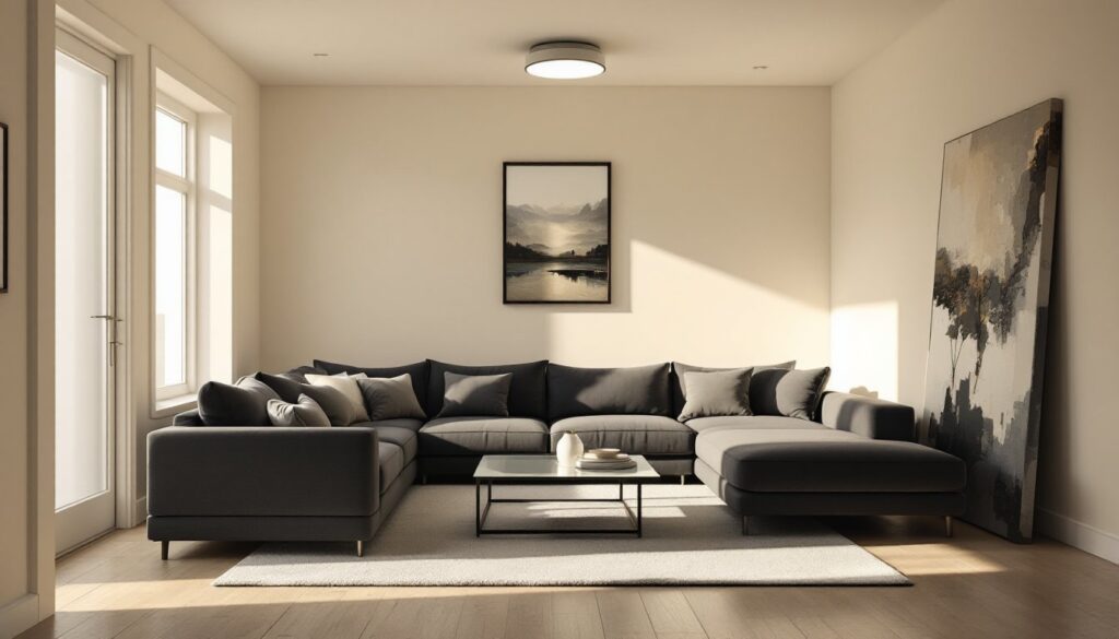
Pull seating 12–24 inches away from walls to establish conversational groupings. Floating furniture defines zones and makes rooms feel intentional rather than haphazard. In rectangular living rooms, angle a sofa or pair of chairs to break up the rigid geometry.
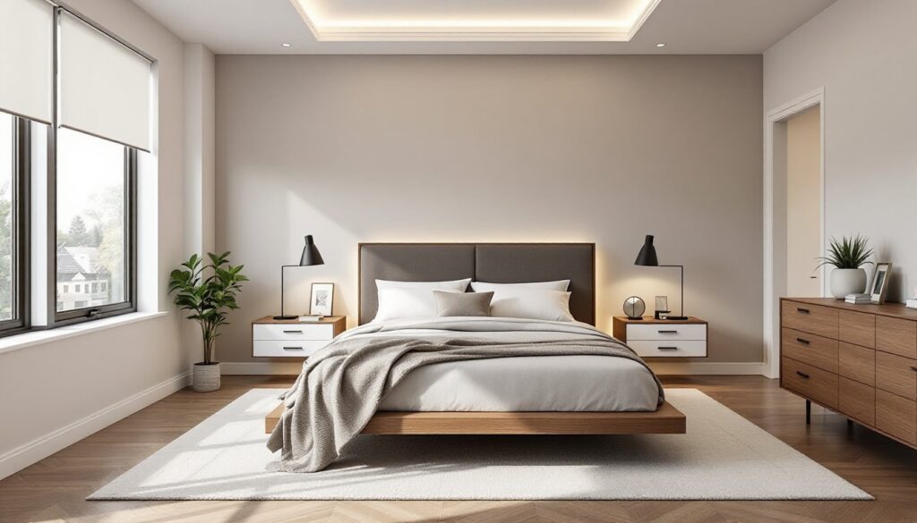
For bedrooms, try positioning the bed away from the wall, centering it on the focal wall with nightstands flanking it. This approach works especially well in larger bedrooms (12×14 or bigger) where wall-mounted furniture feels sparse.
Anchoring furniture groupings with area rugs reinforces the effect. The rug acts as a visual foundation, signaling that the furniture cluster is a deliberate design choice, not a mistake. As many designers note, spaces inspired by professional home design shows often use this floating furniture strategy to balance function and flow.
In smaller rooms where pulling furniture away isn’t practical, create the illusion of depth by adding a narrow console or bookshelf 6–8 inches from the wall. Even minimal separation changes the visual dynamic.
Traffic flow improves when furniture isn’t barricading pathways. Test your layout by walking the room’s natural routes, entry to seating, seating to windows, room to room. If you’re sidestepping obstacles, rearrange.
Overlooking Lighting as a Design Element
Relying on a single overhead fixture is the lighting equivalent of painting every wall builder’s beige, it’s functional but flat. Layered lighting (ambient, task, and accent) adds dimension and usability.
Ambient lighting provides overall illumination. This includes ceiling fixtures, recessed cans, or track lighting. For living spaces, aim for 1.5–2 watts per square foot if using incandescent bulbs, or 20–30 lumens per square foot with LEDs.
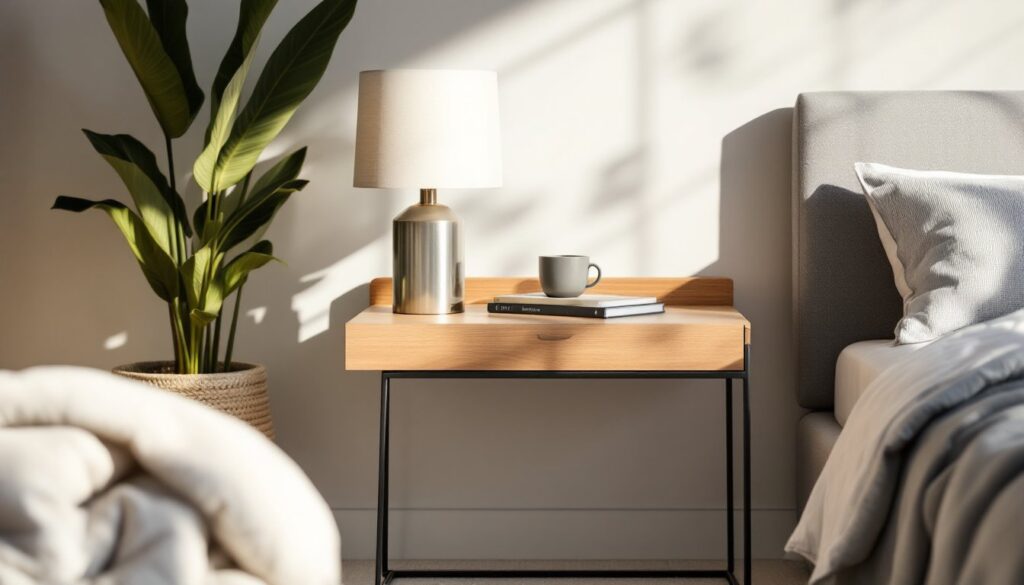
Task lighting targets specific activities: under-cabinet LEDs for kitchen prep, adjustable desk lamps for home offices, reading lights flanking a bed. Inadequate task lighting leads to eye strain and shadows exactly where you need visibility.
Accent lighting highlights architectural details, artwork, or texture. Picture lights, wall sconces, and uplighting create visual interest after dark. Without accent lighting, rooms feel sterile once the sun sets.
Dimmer switches are non-negotiable. Install them on overhead fixtures to adjust mood and reduce energy use. Basic rotary or slide dimmers cost $15–25 and take 15 minutes to swap out (turn off the breaker first).
Window treatments also control natural light. Sheer panels diffuse harsh midday sun, while blackout shades are essential in bedrooms. Layering sheers with heavier drapes offers flexibility.
Color temperature matters. 2700K–3000K bulbs create warm, inviting light for living areas and bedrooms: 3500K–4100K suits kitchens and baths where clarity is needed. Mixing color temperatures in one room creates a disjointed feel, so keep bulbs consistent within each space.
Choosing Paint Colors Before Considering the Entire Room
Picking a paint color first, then trying to build a room around it, usually backfires. Paint is the easiest element to change, it should be one of the last decisions, not the first.
Start with fixed elements: flooring, cabinetry, countertops, tile, upholstery on existing furniture. These are costly or time-consuming to replace, so your paint needs to work with them, not against them.
Test paint samples on multiple walls, not just one. A north-facing wall will render the same color cooler and grayer than a south-facing wall flooded with sunlight. Paint a 2×2-foot section and observe it at different times of day. Even when browsing collections on resources like Homedit, remember that screen colors differ from real-world paint.
Undertones trip up most DIYers. A “gray” can read blue, green, or purple depending on the lighting and surrounding colors. Compare your sample against white trim, existing flooring, and any textiles in the room. If the undertone clashes, the whole palette falls apart.
Sheen affects both appearance and durability. Flat or matte hides imperfections but doesn’t clean well, reserve it for low-traffic areas and ceilings. Eggshell works for most living spaces. Satin is tougher and suits kitchens, baths, and hallways. Semi-gloss on trim and doors provides contrast and stands up to scrubbing.
Coverage varies by color intensity and surface. Most paints cover 350–400 square feet per gallon with two coats on primed drywall. Deep reds, navy, or black may require a tinted primer and three coats to avoid streaking.
Following Trends Without Considering Your Lifestyle
Open shelving in kitchens looks great in photos but demands constant tidying. White slipcovered sofas are elegant until you have kids, pets, or a habit of eating on the couch. Trendy choices that don’t match your actual habits lead to frustration, not style.
Before committing to a design trend, ask: Will this make my daily routine easier or harder? If you cook daily, ditching upper cabinets for open shelves means dust on dishes and nowhere to hide mismatched mugs. If you work from home, an all-white office might feel sterile after eight hours a day.
Performance fabrics have come a long way. If you love the look of linen or velvet but need durability, many manufacturers offer treated versions that resist stains and moisture without looking synthetic. Test swatches for texture and cleanability before ordering upholstery.
Hardware and fixture finishes cycle in and out of fashion (oil-rubbed bronze, brushed nickel, matte black), but swapping them out is inexpensive and DIY-friendly. Paint colors and textiles are equally easy to update. Built-ins, tile, and countertops are not. Keep permanent materials neutral: inject personality through changeable elements.
If you’re drawn to bold patterns or saturated color, incorporate them in removable ways: throw pillows, curtains, art, or an accent wall. Wallpaper with peel-and-stick backing makes commitment-free experimentation possible.
Resist the urge to decorate every surface. Negative space, empty wall sections, clear countertops, gives the eye a rest and makes a room feel intentional. Examples showcasing decorating mistakes often include over-accessorized spaces that look cluttered, not curated.
Neglecting the Power of Texture and Layering
Flat, one-note rooms happen when everything shares the same material quality. All smooth surfaces, all matte finishes, or all hard edges create a monotonous look, even if the color palette is on point.
Mix textures deliberately: a chunky knit throw over leather seating, a jute rug under a glass coffee table, linen curtains against painted drywall. Contrast between rough and smooth, matte and gloss, soft and hard adds richness without additional cost.
Layering starts with the largest surfaces and works down. In a bedroom: a fitted sheet, flat sheet, duvet or quilt, coverlet or blanket, then accent pillows in varying sizes and fabrics. The goal isn’t to pile on as much as possible, but to create depth and visual interest.
Wall treatments contribute texture too. Shiplap, board-and-batten, or picture molding (even the faux versions made from MDF or pine trim) add dimension to flat drywall. These are achievable DIY projects with a miter saw, finish nailer, and patience. If you’re not comfortable with angled cuts, a coping saw and hand-sanding smooth the joints.
Textiles layer both visually and functionally. A dining room benefits from a table runner over a tablecloth, or placemats on bare wood. Living rooms feel cozier with multiple throw pillows (odd numbers look less staged) in different fabrics, not all matching.
Natural materials (wood, stone, linen, wool, rattan) inherently carry texture. Synthetic materials can too, if chosen carefully. A faux sheepskin rug or textured ceramic lamp base adds dimension without breaking the budget.
Avoid the matchy-matchy furniture set trap. Mixing wood tones, metal finishes, and fabric types creates a collected-over-time look that feels authentic rather than staged.
Conclusion
Fixing bad interior design doesn’t require a complete gut job or designer fees. Most mistakes boil down to proportion, placement, lighting strategy, and material selection, all correctable with measuring tape, a furniture dolly, and a willingness to rearrange. Test layouts before committing. Prioritize function alongside aesthetics. And remember that trends fade, but a well-lit room with properly scaled furniture never goes out of style.