
Walking into a room that just feels right isn’t magic, it’s deliberate design. Whether someone’s arranging furniture in a new living room or planning a full renovation, understanding interior design principles transforms guesswork into confident decisions. These aren’t abstract art-school theories: they’re practical frameworks that help anyone create spaces that look balanced, flow naturally, and actually work for everyday life. Mastering these fundamentals means fewer costly mistakes, less furniture rearranging, and rooms that feel as functional as they are attractive.
Table of Contents
ToggleKey Takeaways
- Interior design principles are practical frameworks that prevent costly mistakes and transform guesswork into confident decisions when arranging furniture or planning renovations.
- Balance distributes visual weight through symmetrical, asymmetrical, or radial arrangements—step back and assess if one side of the room feels heavier than the other.
- Proper proportion and scale require using guidelines like the two-thirds rule for furniture dimensions and hanging artwork at 57-60 inches from the floor to maintain visual harmony.
- Rhythm and repetition create natural flow by repeating three colors, material finishes, and shapes throughout your space without creating monotony.
- Every room needs one dominant focal point—whether a natural architectural feature like a fireplace or a created one like an accent wall—supported by lighting and furniture arrangement.
- Unity ties your design together through a consistent 60-30-10 color formula, related materials, and coordinated wood finishes that make the space feel intentionally curated rather than random.
What Are Interior Design Principles and Why Do They Matter?
Interior design principles are foundational guidelines that govern how elements within a space relate to each other. They’re not rigid rules, think of them more like building codes for aesthetics. Just as structural framing requires proper load distribution, visual design needs proper weight distribution across a room.
These principles matter because they prevent common pitfalls: a room cluttered with mismatched furniture, a space that feels cramped even though square footage, or a design that looks great in photos but fails in daily use. They work together, not in isolation. Balance affects proportion, proportion influences rhythm, and all of them support unity.
For DIYers tackling paint jobs, furniture layouts, or full remodels, these principles offer a decision-making framework. Instead of relying on gut feelings or trends that’ll look dated in two years, homeowners can apply time-tested concepts that have guided designers for generations. They’re especially valuable when working within constraints, tight budgets, awkward room shapes, or existing architectural features that can’t be changed without a permit and serious money.
The six core principles, balance, proportion and scale, rhythm and repetition, emphasis, unity, and harmony, form a complete toolkit. Nail these, and the space works. Ignore them, and even expensive furnishings won’t save the design.
Balance: Creating Visual Harmony in Your Home
Balance distributes visual weight so a room doesn’t feel lopsided. It’s not about symmetry alone, it’s about creating equilibrium that feels stable and intentional.
Three types of balance exist:
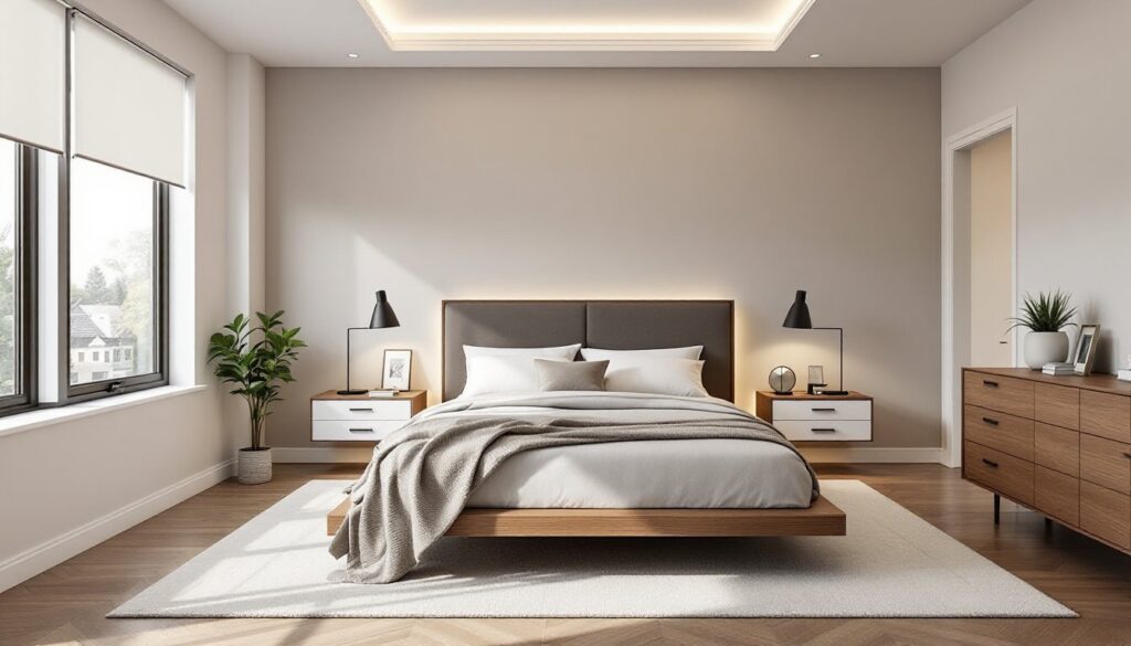
Symmetrical balance mirrors elements on either side of a central axis. Picture identical nightstands flanking a bed, or matching sconces on both sides of a fireplace. It reads formal, traditional, and orderly. Easy to execute, but can feel stiff if overdone.
Asymmetrical balance uses different objects with similar visual weight. A large sectional on one side might balance with two accent chairs and a floor lamp on the other. This approach feels more casual and dynamic. It requires a better eye, weight comes from size, color, texture, and placement, but the payoff is a space that feels collected rather than staged.
Radial balance arranges elements around a central point, like chairs circling a round dining table or a spiral staircase. Less common in residential design, but effective in foyers or rooms with architectural focal points.
Practical application: When arranging furniture, step back and squint. Does one side of the room feel heavier? Dark, bulky pieces carry more weight than light, leggy ones. A gallery wall can balance a large bookshelf. A bold accent wall can offset a furniture-heavy opposite wall.
Many minimalist designs achieve balance through restraint, fewer pieces mean each element’s placement becomes more critical. Don’t confuse balance with blandness: it’s about thoughtful distribution, not playing it safe.
Proportion and Scale: Getting the Size Right
Proportion describes the relationship between elements, how the sofa size relates to the coffee table, or how trim width relates to ceiling height. Scale refers to how those elements relate to the room itself and to human dimensions.
Get this wrong, and everything feels off. A massive sectional in a 10×12 room swallows the space. Tiny accent pillows on an oversized sofa look like afterthoughts. Narrow baseboards in a room with 10-foot ceilings disappear visually.
The Golden Ratio (roughly 1:1.618) shows up everywhere in design, from furniture dimensions to room layouts. It’s not mandatory, but it’s a useful benchmark. More practically, designers often use the two-thirds rule: a coffee table should be about two-thirds the length of the sofa, area rugs should extend at least two-thirds under major furniture pieces.
Common proportion mistakes:
- Hanging artwork too high (center should be 57-60 inches from the floor, the standard gallery height)
- Undersized rugs that make furniture look like it’s floating
- Oversized light fixtures in rooms with standard 8-foot ceilings (fixtures should hang 7 feet minimum from the floor)
- Mixing furniture scales, a delicate mid-century chair next to a chunky farmhouse table
Tool tip: Before buying large pieces, use painter’s tape to mark their footprint on the floor and height on walls. A cardboard template works for visualizing scale. Measure twice, order once.
Standard dimensions matter: dining tables need 36 inches of clearance around them for chairs, kitchen islands require 42-48 inches of aisle space per IRC guidelines for accessibility, and TV height should place the screen center at seated eye level (typically 42 inches for most seating).
Rhythm and Repetition: Guiding the Eye Through Your Space
Rhythm creates movement and flow by repeating visual elements. It’s what makes the eye travel naturally through a space rather than bouncing around aimlessly or getting stuck.
Types of rhythm in interior design:
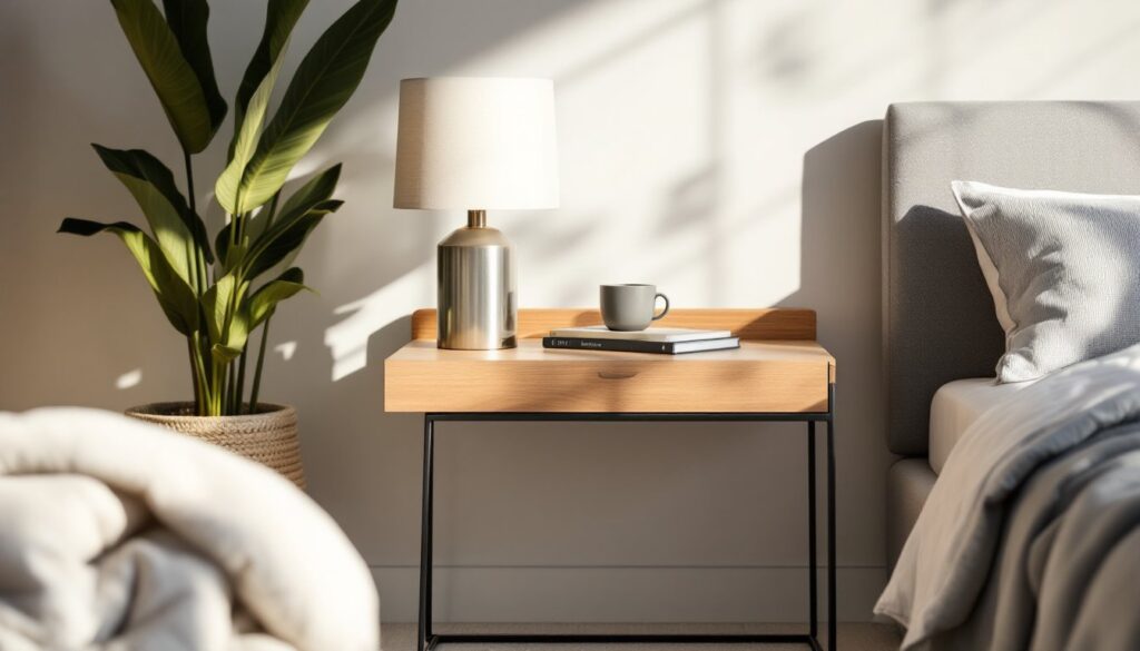
Repetition uses the same element multiple times, a color that appears in artwork, pillows, and a throw: wood tones repeated in flooring, furniture, and trim. It’s the easiest rhythm to establish and the backbone of cohesive design.
Progression gradually changes an element, books arranged by height, paint colors transitioning from light to dark across adjacent walls, or pendant lights in graduated sizes over an island. It creates visual interest through subtle variation.
Transition uses curved lines or shapes to guide the eye, an arched doorway, a curved sofa, rounded edges on a coffee table. This softens the hard geometry most rooms start with (corners, door frames, windows).
Contrast and opposition create rhythm through differences, light against dark, rough against smooth, modern against traditional. This adds energy but requires restraint. Too much contrast feels chaotic.
Practical implementation: Pick three colors and repeat them throughout adjacent rooms for flow. Use the same hardware finish (brushed nickel, matte black, brass) on doors, cabinets, and light fixtures. Repeat a material, if there’s subway tile in the kitchen backsplash, consider it for a bathroom feature wall.
Rhythm doesn’t mean monotony. The design inspiration at MyDomaine often demonstrates how repeating a few key elements creates cohesion while varied textures and shapes maintain interest. Think of it like music: repetition provides structure, but variation prevents boredom.
Emphasis and Focal Points: Drawing Attention Where It Counts
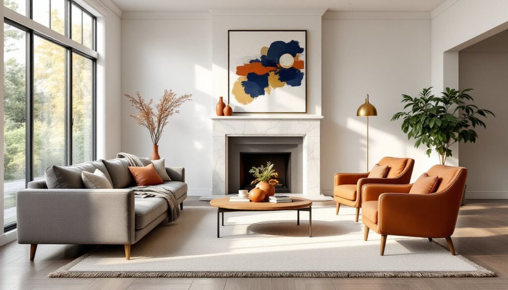
Every room needs a focal point, a dominant feature that anchors the space and captures attention first. Without one, a room lacks direction and impact.
Natural focal points come with the space: fireplaces, large windows with views, architectural features like exposed beams or brick walls, or built-in cabinetry. Work with these, not against them. Arrange furniture to highlight them. A sofa facing a fireplace reinforces it as the focal point: a sofa with its back to the fireplace fights the room’s natural emphasis.
Created focal points are necessary when a room lacks architectural interest: an accent wall (paint, wallpaper, or wood paneling), a gallery wall, a statement light fixture, a large piece of art, or a bold furniture piece like a vintage credenza or colorful sofa.
Rules for emphasis:
- One dominant focal point per room. Multiple competing features create confusion. In an open-concept space, each defined area (living, dining, kitchen) can have its own.
- Support the focal point with lighting, furniture arrangement, and color contrast. If the fireplace is the star, flank it with built-ins or artwork that frames it without competing.
- Scale matters. The focal point should be substantial enough to command attention relative to room size. A 24×36-inch painting won’t anchor a 20-foot wall.
DIY focal point projects:
- Board-and-batten or shiplap accent wall (nominal 1×4 or 1×6 boards, primer, paint, construction adhesive, and a brad nailer)
- Built-in shelving around a window or fireplace (requires basic carpentry skills and potentially a second pair of hands for large pieces)
- Feature wall with peel-and-stick wallpaper or stenciling
- Pendant light cluster over a dining table (verify electrical box rating, most standard boxes support 50 pounds max)
Safety note: Any electrical work beyond changing bulbs typically requires a permit in most jurisdictions and should follow NEC code. If the project involves moving junction boxes or adding circuits, hire a licensed electrician.
Unity and Harmony: Tying Your Design Together
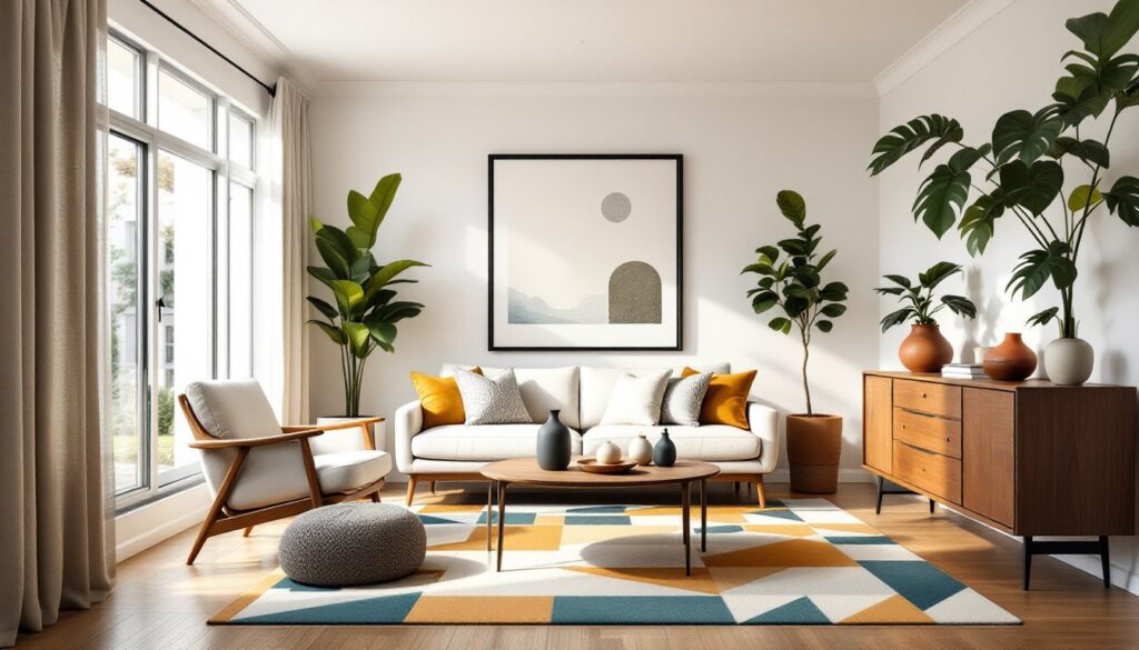
Unity means all elements feel like they belong together, not matching, but related. Harmony takes it further: everything works together in a way that feels complete and intentional.
This principle acts as quality control. A room can have perfect balance, proper scale, and a clear focal point, but still feel disjointed if unity is missing. It’s the difference between a curated collection and a yard sale.
Achieving unity:
Consistent color palette. Use a base (60% of the room, walls, large furniture), a secondary color (30%, drapery, accent chairs), and an accent (10%, pillows, artwork, accessories). This formula, often called the 60-30-10 rule, creates cohesion without monotony.
Related styles. Mixing design styles works, but there should be a common thread, similar wood tones, complementary eras (mid-century modern and contemporary play well together), or shared aesthetic qualities (both industrial and modern farmhouse use raw materials and simple lines).
Material and texture consistency. If using metals, limit to two finishes maximum across a room. Too many, brass, chrome, copper, and oil-rubbed bronze, fragments the design. Similarly, wood finishes should relate: warm tones together, cool tones together.
Repetition of shapes. Rooms dominated by rectangular furniture benefit from some curves. Spaces with lots of curves need some geometry for grounding. The modern living inspiration at Homedit frequently showcases how repeating shapes, round mirrors, circular tables, curved sofas, creates unexpected unity.
Practical tip: Use mood boards before buying. Pin paint chips, fabric samples, furniture screenshots, and finishes to poster board. Live with it for a week. If something feels out of place on the board, it’ll feel worse in the room.
Common unity killers: Too many accent colors, mismatched wood tones without intention, clashing pattern scales (large florals with large geometrics), and trendy pieces that don’t relate to the overall style direction.
Conclusion
Interior design principles aren’t about following formulas, they’re about making informed choices that create spaces where people actually want to spend time. Balance prevents visual chaos. Proper proportion ensures comfort and function. Rhythm creates flow. Emphasis gives rooms purpose. Unity ties it all together. Master these fundamentals, and the room decisions, from paint colors to furniture placement, become clearer and more confident. The result: spaces that work hard and look good doing it.