
Dark, dramatic, and undeniably sophisticated, moody interior design has shifted from niche trend to mainstream favorite. It’s not about making spaces feel smaller or gloomier: it’s about creating depth, warmth, and intimacy through intentional color choices, layered lighting, and rich textures. Whether someone’s renovating a single room or rethinking an entire home, going moody requires more than slapping charcoal paint on the walls. It demands careful planning around natural light, finish selection, and material pairings. Done right, moody interiors feel like a high-end hotel retreat. Done wrong, they can turn a room into a cave.
Table of Contents
ToggleKey Takeaways
- Moody interior design creates depth, warmth, and intimacy through intentional use of deep colors, layered lighting, and rich textures—not just darkness for its own sake.
- Layered lighting combining ambient, task, and accent sources is essential to prevent moody spaces from feeling cave-like and oppressive.
- Deep colors with low Light Reflectance Value (under 20%), such as navy, charcoal, forest green, and burgundy, form the foundation of moody interior design.
- Natural light assessment and strategic material pairings—including wood tones, brass fixtures, and textured fabrics like velvet and linen—balance dark walls and prevent monotony.
- Common mistakes like skipping primer, under-lighting, and matching all elements in the same color should be avoided to achieve a sophisticated, professional moody interior.
- Moody design works best in comfort-focused spaces like bedrooms, dining rooms, and home libraries, while kitchens and bathrooms require careful ventilation and contrast planning.
What Is Moody Interior Design?
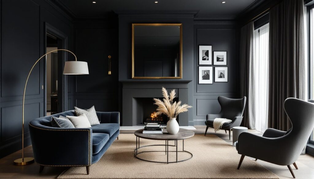
Moody interior design embraces deep, saturated colors, think charcoal grays, midnight blues, forest greens, and rich burgundies, to create spaces that feel enveloping rather than expansive. It’s a deliberate departure from the bright whites and pale neutrals that dominated the last decade. The goal isn’t darkness for its own sake: it’s about cultivating atmosphere, intimacy, and visual interest through contrast and layering.
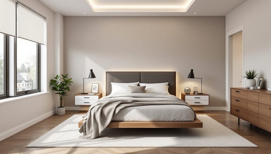
This style works in any room but shines in spaces where comfort and cocoon-like ambiance matter most: bedrooms, home libraries, dining rooms, and media rooms. It pairs well with both modern and traditional furnishings, making it versatile for different home styles. The key is balance, moody design still needs light, both natural and artificial, to prevent spaces from feeling oppressive.
Anyone considering this approach should assess their home’s natural light first. Rooms with south-facing windows or abundant daylight can handle deeper colors without feeling cramped. North-facing or small rooms may need strategic lighting upgrades (recessed cans, wall sconces, or large floor lamps) before committing to a full moody palette.
Color Palettes That Define Moody Interiors
The backbone of moody design is color, specifically, hues with low LRV (Light Reflectance Value), typically under 20%. Popular choices include Benjamin Moore’s Hale Navy, Sherwin-Williams’ Iron Ore, Farrow & Ball’s Railings, and Behr’s Cracked Pepper. These aren’t flat blacks: they’re complex shades that shift with the light throughout the day.
Deep blues and greens bring a natural, grounding feel. Navy, teal, and hunter green work especially well in spaces with wood tones or brass fixtures. Charcoal and slate grays offer a more neutral moody base, pairing easily with both warm and cool accents. Burgundy, plum, and oxblood reds add drama and warmth, ideal for dining rooms or accent walls.
Don’t forget the ceiling, painting it the same deep color as the walls (or even a shade darker) eliminates the visual “box” effect and makes the room feel more cohesive. This technique is common in moody interior styling approaches that emphasize envelope-like comfort.
When selecting paint, test samples in multiple lighting conditions. A color that looks rich and velvety in afternoon sun might read flat and dull under LED bulbs at night. Most paint manufacturers recommend testing a 2’x2′ area for at least 48 hours before committing to full coverage.
Essential Elements for Creating a Moody Atmosphere
Lighting Strategies for Moody Spaces
Lighting is non-negotiable in moody design. Without it, dark walls absorb too much light and create a cave effect. The solution is layered lighting: ambient, task, and accent sources working together.
Ambient lighting provides overall illumination. In moody rooms, this often means recessed LED downlights (4″ or 6″ cans) on dimmer switches, installed 4-6 feet apart. Dimmers are critical, they allow adjustment based on time of day and activity. Choose warm white LEDs (2700K-3000K) over cool whites, which can make dark colors look muddy.
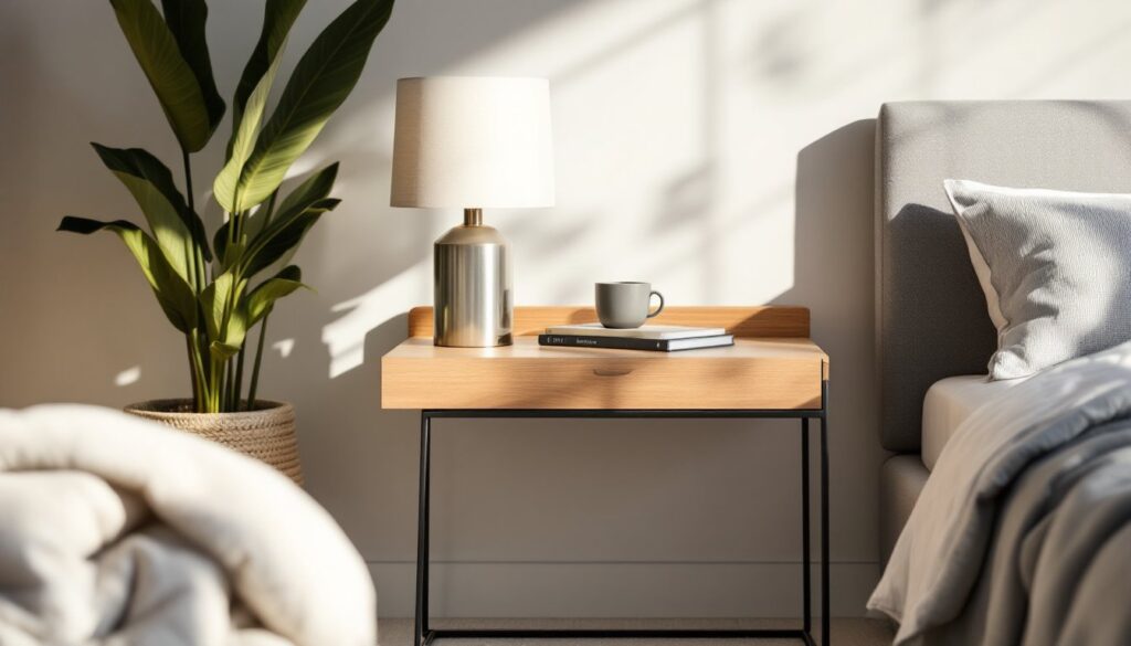
Task lighting targets specific activities: reading lamps beside a chair, pendant lights over a kitchen island, or sconces flanking a bathroom mirror. In moody spaces, these fixtures become decorative focal points, brass or black metal finishes work especially well.
Accent lighting highlights architectural features, artwork, or textures. Picture lights, LED strip lighting behind floating shelves, or uplights in corners add depth and prevent walls from disappearing into shadow. This layering technique is frequently recommended by interior design experts for creating dimension in darker rooms.
One practical tip: install lighting before painting. Cutting in new electrical boxes or running wire is messy work that can damage fresh paint. If adding new fixtures isn’t in the budget, plug-in options (arc floor lamps, battery-operated puck lights) can fill gaps without requiring an electrician.
Textures and Materials That Enhance the Mood
Texture prevents moody spaces from feeling flat or monotone. Velvet, linen, leather, and wool all catch light differently, creating visual interest even within a narrow color palette. A charcoal velvet sofa against a charcoal wall works because the fabric’s nap reflects light, while the matte wall absorbs it.
Natural wood, walnut, oak, or reclaimed pine, warms up dark spaces and adds organic contrast. Exposed beams, hardwood floors, or even a live-edge console table break up the heaviness of deep walls. Avoid overly glossy or laminate finishes: they read cheap against rich colors.
Metal accents in brass, bronze, or matte black provide necessary contrast. Cabinet hardware, light fixtures, curtain rods, and mirror frames are all opportunities to introduce metallic warmth. Brass especially pairs beautifully with navy, green, and burgundy.
Stone and concrete add industrial edge. A marble fireplace surround, concrete countertops, or a slate tile backsplash introduces cool, textural contrast without disrupting the moody palette. These materials work best in kitchens, bathrooms, and entryways where durability matters.
One often-overlooked element: window treatments. Heavy linen or velvet drapes in complementary deep tones soften hard edges and improve acoustics. They also allow control over natural light, critical when balancing a dark palette with functional visibility.
Room-by-Room Guide to Moody Design
Bedrooms are naturals for moody design. Dark walls create a cocoon effect that promotes relaxation. Pair deep wall colors with white or cream bedding for contrast, and layer in textured throws and pillows. Bedside sconces or pendant lights free up nightstand space while providing focused reading light. If the room is small, keep the furniture minimal and use a large mirror to reflect available light.
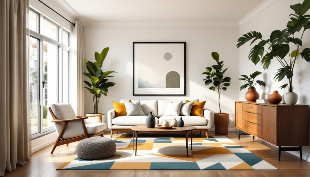
Living rooms benefit from moody palettes when they have good natural light or tall ceilings. A dark accent wall behind a sofa or fireplace anchors the space without overwhelming it. Balance dark walls with lighter upholstery or a jute rug to prevent the room from feeling too heavy. Floor lamps and table lamps become design statements, choose sculptural pieces in brass or black metal.
Dining rooms are ideal candidates for full moody treatment. These spaces are typically used in the evening when ambient lighting matters more than natural light. Deep color schemes with dramatic finishes make meals feel more intimate and special. A statement chandelier or pendant over the table becomes the room’s focal point. Consider wallpaper with subtle texture or pattern for added depth.
Bathrooms can go moody if they have adequate ventilation and lighting. Dark tile (matte black subway, charcoal hexagon) or painted walls work well with white fixtures for contrast. Backlit mirrors, sconces on either side of the vanity, and recessed shower lighting prevent the space from feeling claustrophobic. Use high-gloss or semi-gloss paint in bathrooms for moisture resistance.
Home offices gain sophistication with moody palettes, but task lighting is essential. A dark wall behind the desk reduces screen glare, while lighter walls elsewhere prevent eye strain. Built-in shelving painted the same deep color creates a library effect. Add a desk lamp with adjustable brightness and ensure overhead lighting is sufficient for video calls.
Kitchens require careful planning. Dark cabinets (charcoal, navy, forest green) look stunning but show dust and fingerprints more than lighter finishes. Pair them with light countertops (white quartz, marble, or light wood butcher block) and a tile backsplash in a contrasting tone. Under-cabinet LED strips are non-negotiable for task lighting. If going full moody, ensure the kitchen has a window or skylight, artificial light alone can make food prep difficult.
Common Mistakes to Avoid When Going Moody
Skipping the primer. Dark paints, especially deep blues and blacks, require a tinted primer that closely matches the final color. Skipping this step or using standard white primer can require four or more coats for even coverage. Most paint stores will tint primer to 50-70% of the final color, use it.
Ignoring sheen. Flat or matte finishes are standard for moody walls because they absorb light and hide imperfections. But they’re also harder to clean. In high-traffic areas or homes with kids and pets, consider eggshell or satin finishes, which offer some washability without too much shine. Save flat finishes for low-traffic spaces like bedrooms or dining rooms.
Under-lighting the space. Dark walls need 50-100% more light than light walls to achieve the same perceived brightness. Budget for additional fixtures, dimmer switches, and higher-wattage bulbs (or lumen-equivalent LEDs). If the room feels dim even with lights on, it’s under-lit, period.
Matching everything. A moody room isn’t a monochrome room. Introduce contrast through white trim, light wood furniture, metallic accents, or patterned textiles. Without these breaks, the eye has nowhere to rest and the space feels oppressive rather than cozy.
Forgetting about trim and doors. Dark walls make scuffed or yellowed trim and doors look worse. Plan to refresh trim in bright white or off-white before or immediately after painting walls. Semi-gloss or high-gloss paint on trim also reflects light back into the room, which dark walls need.
Rushing the process. Moody design is an investment in time and materials. Proper prep, patching holes, sanding, priming, cutting in carefully, makes the difference between a professional-looking result and a DIY disaster. Most pros recommend two coats minimum for deep colors, with 4-6 hours drying time between coats. Don’t skip steps to save a day: it’ll show.