
Negative space isn’t about leaving rooms empty, it’s about designing with intention. Too many homeowners pack every surface, corner, and wall, thinking more furnishings equal a finished room. The result? Visual clutter that makes even spacious homes feel cramped. Mastering negative space means understanding how empty areas balance occupied ones, guiding the eye and creating rooms that breathe. Whether renovating a single room or rethinking an entire floor plan, knowing how to plan and preserve negative space transforms chaotic layouts into calm, functional spaces.
Table of Contents
ToggleKey Takeaways
- Negative space interior design is intentional emptiness that balances occupied areas, making rooms feel larger, calmer, and more organized by allowing the eye to rest and movement to flow naturally.
- Aim to keep approximately one-third of your floor and wall space unoccupied, using a two-thirds furniture/decor to one-third open space ratio as a practical baseline for most rooms.
- Float furniture 12–18 inches away from walls and limit your color palette to 2–3 main colors to create clear sightlines and enhance the visual perception of negative space.
- Traffic patterns in your room should maintain 30-inch-wide walkways minimum, with negative space framing rather than interrupting movement paths for both safety and comfort.
- Avoid common mistakes like confusing empty space with unfinished design, scaling negative space incorrectly for your room size, or filling space out of fear before allowing layouts time to feel balanced.
- Strategic negative space highlights focal points and statement pieces while increasing room flexibility, allowing spaces to adapt when needs change without requiring complete furniture reshuffles.
What Is Negative Space in Interior Design?
Negative space is the unoccupied area between and around objects in a room, the open floor, bare wall sections, and breathing room between furniture pieces. It’s not wasted space: it’s intentional emptiness that defines and highlights what is there.
Think of it like the margins on a page. Without them, text becomes unreadable. In a room, negative space provides visual rest, directs attention to focal points, and allows movement. A sofa placed against a wall with nothing above it creates negative space that emphasizes the furniture’s lines and the wall’s texture.
Designers distinguish between macro negative space (large open areas like walkways and empty walls) and micro negative space (smaller gaps, like the space between throw pillows or the clearance around a light fixture). Both matter. Too little of either creates a cluttered, claustrophobic feel. Nail the balance, and rooms feel larger than their square footage suggests.
Why Negative Space Matters in Your Home
Negative space isn’t a minimalist trend, it’s a functional design principle that affects how rooms perform.
It improves traffic flow. Open floor paths let people move without sidestepping furniture or bruising shins on coffee table corners. Building codes typically recommend 36-inch-wide walkways in main living areas: negative space makes that possible without sacrificing seating or storage.
It reduces visual stress. Overcrowded rooms force the brain to process too many objects at once. Strategic negative space lets the eye rest, which is why contemporary design approaches often emphasize clean lines and breathing room. Studies show people perceive well-spaced rooms as larger, cleaner, and more organized, even when actual square footage is identical to cluttered counterparts.
It highlights what matters. A statement piece, a mid-century credenza, a gallery wall, an architectural feature, gets lost in a crowded room. Negative space acts like a spotlight, drawing attention to the elements worth noticing.
Finally, it increases flexibility. Rooms with built-in breathing room adapt more easily when needs change. That open corner can become a reading nook, a plant display, or temporary workspace without requiring a full furniture reshuffle.
How to Identify and Plan Negative Space in Any Room
Start by assessing what’s already there, or in most cases, what’s too much there.
Create a scaled floor plan. Graph paper works, but free tools like graph paper apps or simple sketch software make this easier. Mark doorways, windows, and permanent fixtures (radiators, built-ins). Then plot existing furniture to scale. Seeing a bird’s-eye view reveals how little open space remains.
Apply the two-thirds rule. Aim to keep roughly one-third of floor space and wall space unoccupied. This isn’t rigid, a cozy den can go denser, while an entryway benefits from more openness, but it’s a useful baseline. Measure total square footage, then calculate what 30-35% looks like in real feet.
Identify traffic patterns. Walk through the room like you’re using it: entering, reaching the sofa, accessing storage, moving to windows. Mark these paths on your plan. Any route narrower than 30 inches (24 inches absolute minimum) needs intervention. Negative space should frame these pathways, not interrupt them.
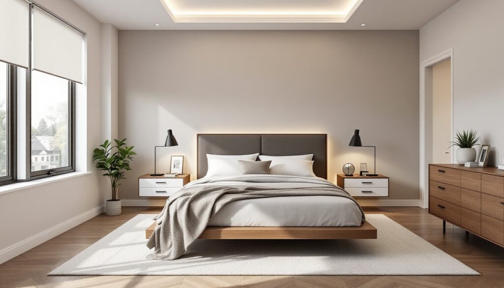
Evaluate wall coverage. Stand in the doorway and scan walls. If more than 70% of wall surface holds art, shelving, or mounted items, it’s likely over-decorated. Negative wall space matters as much as floor space. Leave at least one wall section, ideally 4 to 6 feet wide, completely bare or with a single focal piece.
Practical Ways to Incorporate Negative Space Into Your Design
Furniture Placement and Scale
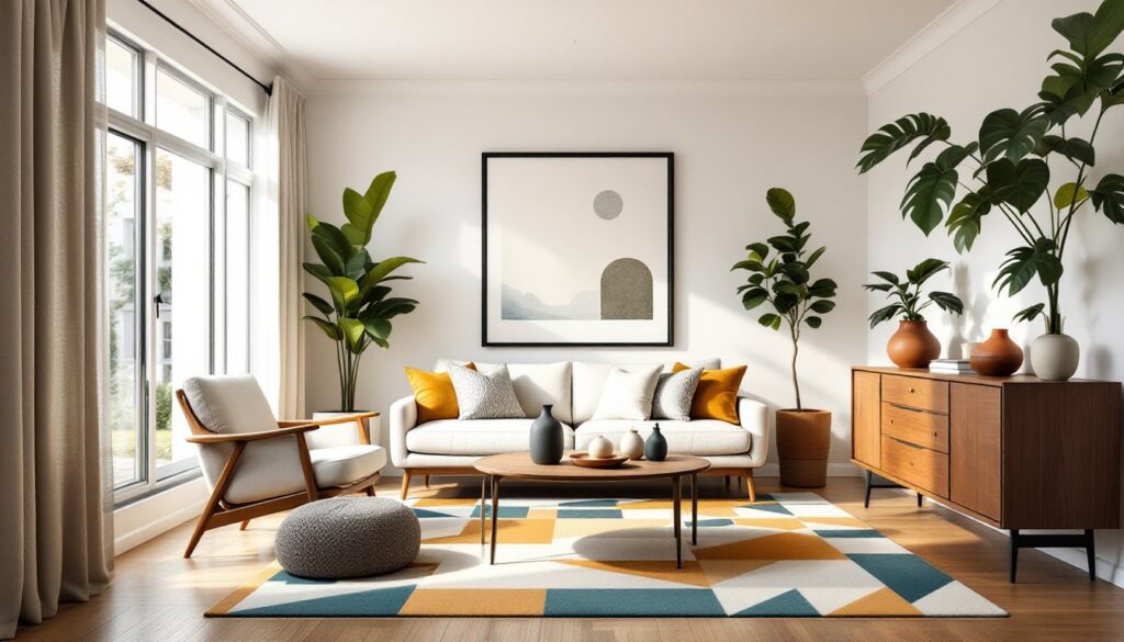
Choose appropriately scaled furniture. Oversized sectionals in small rooms devour negative space. Measure before buying: a standard three-seat sofa runs 80-90 inches wide, while apartment-sized versions come in at 68-80 inches. In rooms under 200 square feet, smaller-scale pieces preserve breathing room without sacrificing seating.
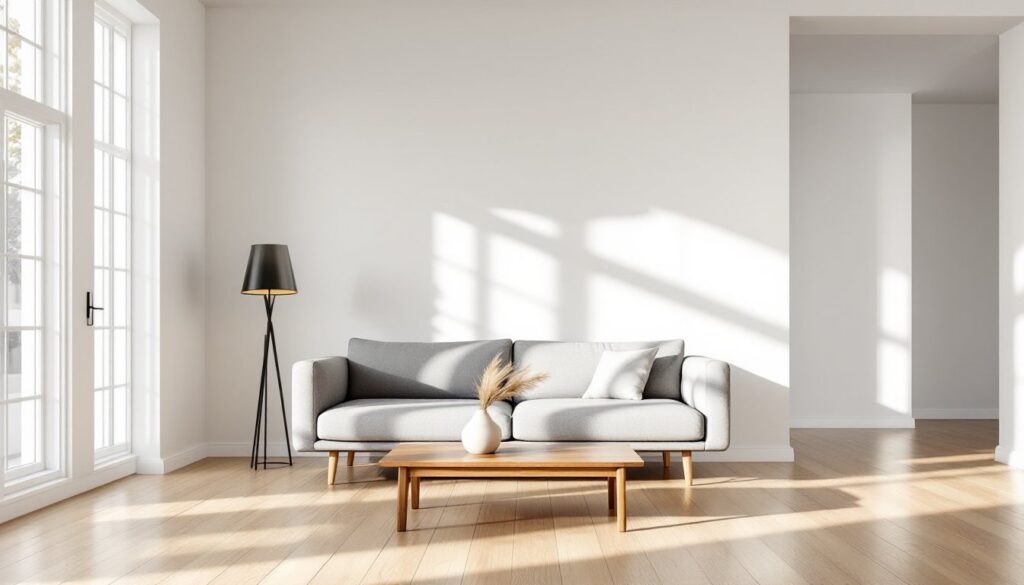
Float furniture away from walls. Pushing everything against the perimeter feels safe but often wastes the room’s center. Pull the sofa 12-18 inches off the wall, float a bed with space on three sides, or center a dining table with clearance all around. This creates negative space around furniture, making pieces feel intentional rather than crammed.
Limit furniture quantity. Not every room needs a sofa, loveseat, two chairs, and an ottoman. Pare down to essentials plus one or two accent pieces. A living room can function beautifully with a sofa, one chair, a coffee table, and a console, leaving corners and wall sections open.
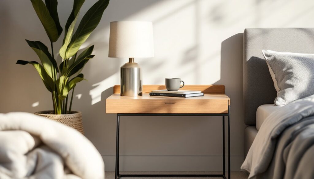
Use multipurpose pieces. An ottoman with storage eliminates the need for a separate side table and basket. A console table behind a sofa serves as both display and workspace, reducing the need for additional furniture.
Color, Light, and Visual Flow
Stick to a limited color palette. Visual clutter comes from too many colors competing for attention. Choose two to three main colors plus one accent. Browsing curated design galleries shows how restrained palettes allow negative space to read more clearly, the eye registers openness rather than jumping between colors.
Paint walls and trim the same color. This erases visual boundaries, making walls recede and spaces feel larger. White, off-white, and light neutrals work best, but even deeper colors applied consistently create the effect. Avoid accent walls in small rooms: they fragment space and reduce perceived negative areas.
Maximize natural light. Heavy drapes, dark walls, and insufficient lighting make negative space disappear visually. Use sheer curtains or leave windows bare if privacy allows. Add task lighting to eliminate dark corners, rooms with even light distribution show off their negative space.
Clear sightlines. Position furniture so the longest view through the room stays unobstructed. In open-plan homes, align furniture groupings to maintain visual flow between zones. Modern design galleries frequently showcase how clear sightlines enhance the perception of negative space across multiple rooms.
Common Mistakes to Avoid When Using Negative Space
Confusing empty with unfinished. A room with negative space should still feel intentional. Bare walls need good paint (two coats over primer for even coverage), clean baseboards, and proper lighting. Empty corners benefit from architectural details, crown molding, a floor register upgrade, or a statement light fixture, that show the space is designed, not neglected.
Scaling negative space incorrectly. Too much emptiness in a large room feels cold and echoes. Too little in a small room creates claustrophobia. Adjust proportions to room size: a 10×12 bedroom needs more furniture density than a 20×25 great room, where expansive negative space works.
Ignoring vertical space. Negative space applies up and down, not just across floors. Avoid stacking shelves floor-to-ceiling or hanging art too low. Leave upper wall sections open. Standard art hanging height is 57-60 inches to the center: anything higher compresses visual space above furniture.
Filling space out of fear. Homeowners panic when rooms feel “empty” and rush to add decor. Give new layouts time, live with negative space for two weeks before adding anything. What feels bare initially often feels balanced after adjustment.
Overlooking function. Negative space can’t interfere with use. Don’t sacrifice a needed bookshelf or seating just to create emptiness. Functional negative space supports activities: decorative-only negative space might look good in photos but fails daily living. Balance is the goal, not austerity.
Negative space isn’t about deprivation, it’s about designing rooms where every piece matters and nothing competes. Measure carefully, edit ruthlessly, and let the room breathe.