
Interior design isn’t just about buying furniture or slapping a fresh coat of paint on the walls. It’s about understanding the fundamental building blocks that make a room feel balanced, functional, and intentional. Whether someone’s planning a full renovation or just tweaking what they’ve got, knowing these seven core elements gives them a framework to work from, not a rulebook, but a toolkit. These principles apply whether they’re working with a 10×12 bedroom or an open-concept great room, and once they recognize how each element plays off the others, decisions get a lot easier.
Table of Contents
ToggleKey Takeaways
- Interior design elements—space, line, form, color, texture, pattern, and light—are the foundational building blocks that guide how a room looks, feels, and functions without requiring formal design training.
- Understanding space means balancing negative space (breathing room) with positive space, and using the room’s actual dimensions, ceiling height, and layout strategy to maximize flow and avoid overcrowding.
- Lines embedded in architecture, furniture, and décor (horizontal, vertical, and dynamic) guide the eye and create visual harmony, so matching line directions prevents chaotic room feelings.
- Color sets mood and emotion, so apply the 60-30-10 rule to maintain a cohesive palette while testing paint samples in different lighting conditions before committing.
- Layering different light sources—ambient, task, and accent lighting—transforms a space far more effectively than relying on overhead fixtures alone, and dimmer switches add flexibility at minimal cost.
- Texture and pattern add depth and interest when mixed deliberately by varying scale, pairing smooth with rough surfaces, and using consistent color palettes to tie designs together.
What Are Interior Design Elements?
Interior design elements are the foundational components that designers, and DIY decorators, manipulate to create a cohesive, functional space. Think of them as the ingredients in a recipe: mess up the proportions, and the whole dish falls flat. Get them right, and everything clicks.
These elements include space, line, form, color, texture, pattern, and light. They’re not trends. They don’t go out of style. They’re structural concepts that guide how a room looks, feels, and functions. A homeowner doesn’t need a degree in design to use them, just a working understanding of what each one does and how they interact.
Unlike design principles (balance, rhythm, emphasis), which describe how to arrange things, elements are the what, the raw materials someone works with. Master these, and the principles follow naturally.
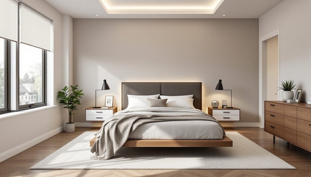
Space: The Foundation of Every Design
Space is the canvas. It’s the physical area someone’s working with, and it includes both the empty areas (negative space) and the filled ones (positive space). A common mistake is treating every square foot like it needs something in it. It doesn’t. Negative space, the breathing room around furniture and décor, is just as critical as what fills the room.
There are two types: 2D space (floor area, measured in square footage) and 3D space (volume, which includes ceiling height). A room with 9-foot ceilings feels different than one with 8-foot ceilings, even if the floor plan’s identical. Vaulted ceilings, exposed beams, and built-ins all affect how space is perceived.
When planning a layout, start with the room’s actual dimensions, not what it looks like in photos. Measure wall-to-wall, note door swings, window placement, and any architectural quirks like radiators or angled walls. Use painter’s tape on the floor to map out furniture footprints before moving anything. This avoids the classic mistake of buying a sofa that technically fits but kills the flow.
For small spaces, vertical storage and lighter furniture help maximize usable area without crowding. In larger rooms, area rugs and furniture groupings define zones, living area, reading nook, workspace, so the space doesn’t feel like a bowling alley.
Line: Creating Movement and Visual Flow
Lines guide the eye. They’re embedded in everything, floorboards, crown molding, furniture edges, window frames, even the seams in drywall. When home decor elements share common line direction, the result is harmony. When they clash, the room feels chaotic.
There are three main types:
- Horizontal lines (baseboards, countertops, long sofas) create a sense of stability and make spaces feel wider.
- Vertical lines (tall bookcases, floor-to-ceiling drapes, wainscoting) draw the eye up and make ceilings feel higher.
- Dynamic lines (diagonal or curved, think arched doorways, angled staircases, or round mirrors) add energy and movement.
In most rooms, horizontal and vertical lines dominate. A mix is fine, but too many competing angles, diagonal shelving next to a zigzag rug next to chevron curtains, creates visual noise. If the architecture leans horizontal (ranch-style homes, low ceilings), adding vertical elements like tall lamps or vertical shiplap can balance things out.
Lines also show up in trim work. A simple chair rail at 32–36 inches adds a horizontal break. Board-and-batten siding or vertical paneling emphasizes height. When installing trim, use a laser level and a miter saw for clean, professional joints, hand-cutting angles rarely looks as sharp.
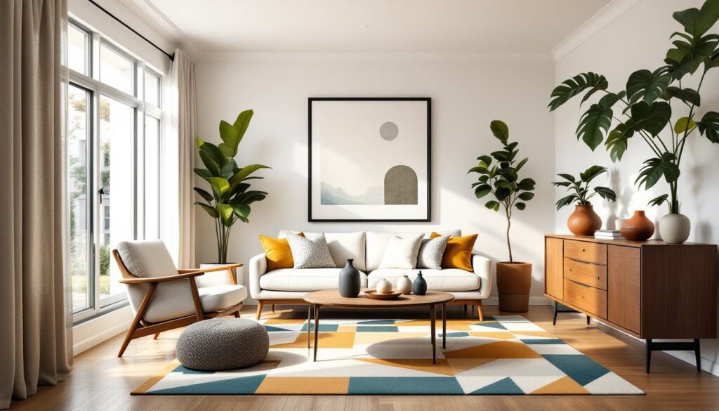
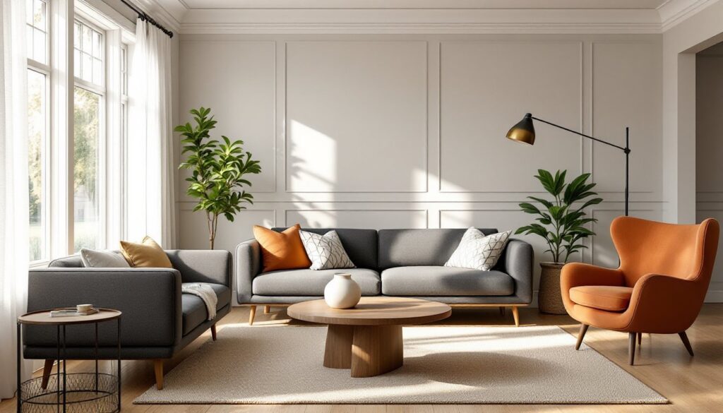
Form and Shape: Adding Dimension to Your Rooms
Form refers to the three-dimensional shape of objects, furniture, fixtures, architectural details. Shape is the two-dimensional outline. In practice, people mostly deal with form: the silhouette of a chair, the profile of a pendant light, the bulk of a dresser.
Forms fall into two categories:
- Geometric (squares, rectangles, triangles, circles), clean, structured, often modern or traditional.
- Organic (irregular, flowing, natural), softer, more casual, often found in live-edge wood, curved sofas, or sculptural décor.
A room full of hard geometric forms, blocky furniture, square art, rectangular rugs, can feel rigid. Mixing in organic shapes, a round coffee table, a curved-back chair, or even a potted plant, softens the space. Conversely, a room with too many organic elements can lack structure. Balance is key.
When choosing furniture, consider scale and proportion. A sectional sofa works in a large family room but overwhelms a 12×14 space. A delicate side table looks lost next to a chunky leather recliner. Before buying, measure the piece and compare it to the room’s dimensions and adjacent furniture. Many interior design layouts show scaled floor plans, use graph paper or free tools like RoomSketcher to mock up arrangements.
Color: Setting the Mood and Personality
Color is the most immediate, and most emotional, design element. It sets mood, defines style, and ties a room together. It’s also the easiest to get wrong, because paint chips look different under showroom lights than they do in a north-facing bedroom at 7 a.m.
Start with the 60-30-10 rule: 60% dominant color (walls, large furniture), 30% secondary color (accent furniture, drapes), and 10% accent color (pillows, art, accessories). This keeps the palette cohesive without feeling monotonous.
Warm colors (reds, oranges, yellows) energize a space and make it feel cozier, but also smaller. They work well in social areas like kitchens and dining rooms. Cool colors (blues, greens, purples) calm things down and make rooms feel more spacious. They’re ideal for bedrooms and bathrooms.
Neutral colors (whites, grays, beiges, taupes) provide a flexible backdrop and won’t clash with future décor changes. But not all neutrals are equal. Greige (gray + beige) can look muddy in some lighting. Pure white can feel sterile or clinical without warm accents. Always test paint samples on multiple walls and observe them in morning, midday, and evening light before committing.
Paint coverage averages 350–400 square feet per gallon for a single coat, but textured walls or darker base colors may require two coats. Use a high-quality primer, it improves adhesion, hides stains, and reduces the number of topcoats needed.
Texture and Pattern: Bringing Depth and Interest
Texture is how a surface feels, or looks like it feels. It’s the nubby weave of a linen sofa, the grain in a wood floor, the smooth gloss of subway tile. Pattern is a repeated decorative design, stripes, florals, geometric prints.
Both add visual interest and depth, especially in neutral or monochromatic rooms. A white-on-white bedroom can feel lifeless without texture, add a chunky knit throw, a jute rug, linen curtains, and suddenly it has dimension.
Mix textures deliberately:
- Pair smooth with rough (glossy tile with matte paint, velvet pillows with a jute rug).
- Combine soft with hard (upholstered chairs with a wood dining table).
- Layer textiles (throws over bedding, pillows in different fabrics).
When mixing patterns, vary the scale. A large floral with a small geometric or a wide stripe with a tight check works. Three patterns in the same size compete and create visual clutter. Stick to a shared color palette to tie them together.
Texture also shows up in architectural finishes. Beadboard, shiplap, and board-and-batten all add tactile and visual texture to walls. Installing them is straightforward, most use 1×4 or 1×6 pine boards (actual dimensions: 3/4″ × 3.5″ or 3/4″ × 5.5″), attached to studs with a brad nailer or construction adhesive. Sand, prime, and paint for a clean finish.
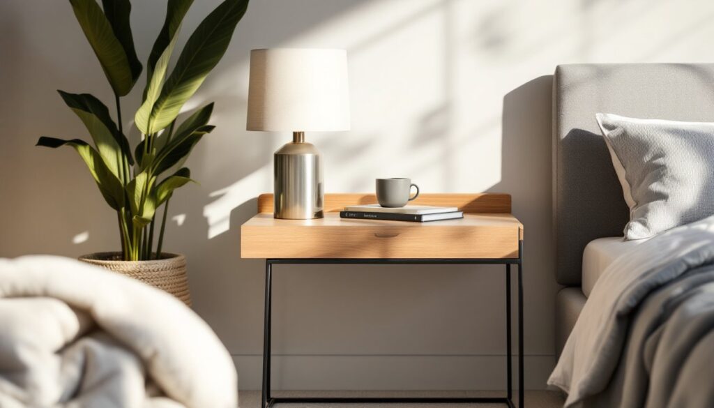
Light: The Element That Brings It All Together
Light is the most powerful, and most overlooked, design element. It affects how colors read, how textures appear, and how a space feels at different times of day. A room with poor lighting will never look right, no matter how thoughtfully it’s decorated.
There are three types:
- Ambient lighting (overhead fixtures, recessed cans) provides general illumination.
- Task lighting (under-cabinet strips, desk lamps, vanity lights) focuses on specific activities.
- Accent lighting (picture lights, sconces, track lighting) highlights architectural features or décor.
Every room needs a mix. Relying solely on overhead lighting flattens a space and creates harsh shadows. Layer in table lamps, floor lamps, and wall sconces to add depth and flexibility. Dimmer switches are cheap ($15–$25 per switch) and let someone adjust mood and functionality.
Natural light is its own category. South-facing windows get bright, warm light all day. North-facing windows provide cooler, even light that’s great for workspaces but can make colors look flat. East- and west-facing windows shift dramatically, morning sun versus evening glare.
Window treatments control natural light. Sheer curtains diffuse it. Blackout drapes block it. Cellular shades insulate while filtering. For maximum flexibility, install a double rod and layer sheers with heavier drapes.
When installing new fixtures, follow NEC code (National Electrical Code). Most ceiling fixtures require a junction box rated for the fixture’s weight, typically 50 lbs for standard fixtures, more for chandeliers. If the existing box isn’t rated, swap it before hanging anything heavy. Electrical work beyond swapping a fixture often requires a permit and a licensed electrician, depending on jurisdiction.
Finally, lighting design strategies often recommend bulb temperature: 2700–3000K (warm white) for living spaces, 3500–4100K (neutral white) for kitchens and baths, 5000K+ (daylight) for workshops or task-heavy areas. Match color temperature across a room, mixing warm and cool bulbs looks unintentional and sloppy.